After sketching out some initial ideas for the goat collective brief I decided on going down the typographic route. I want to create a letterpress poster using a powerful quote to highlight waste in our society.
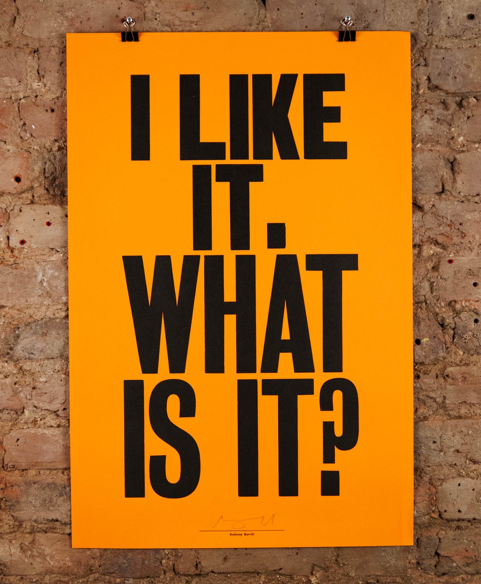
The first artist that came to mind was Anthony Burrill. His work is the epitome of bold and powerful typography. The type that he choses to set his text in is a very traditional sans serif that was used a lot on old posters when letterpress was more popular. It almost makes it seem like a poster for the government as the typeface gives a very official feeling to it. I suppose this adds to its commanding and in your face nature.

This letterpress printed poster was created to celebrate the one year anniversary of 20x200 an online gallery of affordable art. Designed and printed in 3 colours using wood type and existing printer's cuts and ornaments. I really like the use of the background elements here, I could try and replicate this with mono printing techniques. However I do feel that the mixture of colours and illustrations behind the text distracts from the main type. The type would look a lot more bold and powerful if it was on its own.

This print struck my eye the most. I absolutely love how they have replicated a smudge within the design. I think for my piece I will definitely experiment with doing something different like this to make it stand out from the crowd. Although I think that this has been screenprinted, I could try spraying oil onto the type when inked up to smudge it like this.
No comments:
Post a Comment