To produce the typographic piece I decided to use the assorted wood block type that they have at Vernon Street. They have literally boxes full of old wood type that don't match. I find this quite relevant to the brief because the type has been disposed of basically.

I experimented lots with the inking process of this. Once I had chosen out the miss matched letterforms and set them out into my desired quote I went about trying new things with ink.
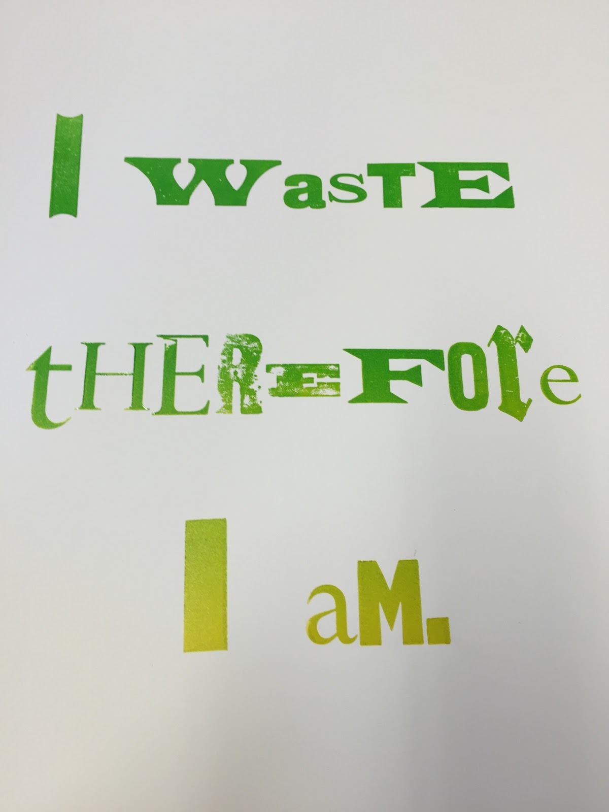
First of all I created a gradient from green to yellow by blending two of the inks together using the roller. Initially I had some issues with the 'R' and the 'E' of the therefore which you can see above. I had to pad the two letters with paper because the e that was before them was slightly taller so the letters didn't meet the paper properly.

I also experimented with a mirroring effect using freshly applied ink and left over ink to create a sort of blurred effect which I find quite fascinating.


Moving on I wanted to experiment with trying to get a marbling effect to the prints. I knew that this would have been very easy to do if I had screen printed it but with the screen printing inks environmental complications I felt this would not suit the brief. Also the organic-ness of the wood block type cannot be replicated well in my opinion. So I came up with an idea of getting another roller and sort of sea-sawing it across the inked up type to add mottled lines to it. I think that this worked really well, and I experimented with these prints across a range of different stock choices, my favourite being a recycled paper that the printing technician described as "loo roll card". This fit perfectly to the ethos that I was going for.


No comments:
Post a Comment