Saturday 27 February 2016

OUGD503 - Collaborative - Storyboarding/Scripting

Today we met as a group to finalise the plot of our animation. We decided previously on what to include so it was just a case of getting it in the right order with good timing too. I also tried to outline what was going to be said by the narrator where so that we could start to work on a script. 


The animators then drew up a proper version of the storyboard which make a lot more sense than my scrawling. 


OUGD503 - Collaborative - Final Environments

Below are all of the final segments for the environment for the animation. 


I am really pleased with the final designs and I feel like I have learnt a lot of new techniques by creating them. Having never done environment design before it was a challenge for me but I think I would be willing to do it again. There are subtle things that I would change if I was to do these designs again however due to the time limit I couldn't perfect them in the way that I wanted to. 

Friday 26 February 2016

OUGD503 - Individual Practice - Secret 7" - Final Sleeve

This was my final submission to Secret 7" for Max Richter's Dream 3. 


Considering that I completed this within one day I am quite proud of myself. I have shown myself that I can speed up the design process if I need to and do shorter briefs. Maybe I will try to limit myself for some other briefs as it cuts out the unnecessary parts and lets me only do parts of the design process that I deem important. I am quite pleased with the outcome as i believe that it creates a quite abstract feeling and thought process to it which is what I was going for. I like how with Secret 7" you can do anything you want and explore sides of design and illustration that isn't usually relevant with any other design briefs. It lets me break out my more fine art background and go mad with it. 

I found out that I didn't get into the exhibition this year despite my efforts. I am disappointed by this but it will only make me try a bit harder next year. 

Thursday 25 February 2016

OUGD503 - Individual Practice - Secret 7" - Digital Development

I took some of my sketched ideas into illustrator to see how they would come out digitally. If I had more time I would have probably made these out of paper cut as the depth and shadows created would have added that extra bit of interest.


This was my first attempt at the dreamscape that I had envisioned. I used overlapping shapes of different opacities to add a sort of flow to the landscape. Adding in a subtle sky that seems to fade off into the distance letting the viewer of the piece imagine what might be beyond the horizon. 


I thought that the first dreamscape was a little too obvious as a landscape so I stripped back the obvious skyline and simply made the waves of the landscape fade to yellow. I really like the shapes that the overlapping waves create, adding extra depth to the piece. Also it does feel more dreamlike now because it fades into this bright yellow that some might think is the sun or perhaps it's something more than that. Out of the two dreamscapes that I have created this is my favourite because of the abstract view that it creates that could have so many different connotations from different people.


I also traced around the REM brain scan and found that it looked rather eery. The shapes form together to create what almost looks like a face staring back at you. However with the colour being blue it looks like it could be a topological map of a bit of the ocean so I think that I will have to change the colours. 


I changed to shades of grey instead and added a sort of grainy texture over it to give it the feel of an x-ray of sorts adding to this feeling of unease. I like this because it portrays that sleep doesn't always bring good dreams, they could be rather sinister nightmares. So dreaming can be a mixture of good and bad. I think that this will be my final piece because of this mixture of emotions that it conjures. 

Wednesday 24 February 2016

OUGD503 - Individual Practice - Secret 7" - Initial Ideas

I decided kind of last minute that I wanted to produce a quick entry to secret 7". So I set it myself as a one day brief that I could produce and submit in the same day. Having listened to most of the songs the one that spoke to me the most was Max Richter's 'Dream 3' which was written in order to make people fall asleep or relax them. As always I started by sketching out some thumbnails in my sketchbook for some ideas to start designing.


I had a lot of ideas that involved dreams not only because of the title of this song but when I listened to it, it made my mind wander and daydream. I thought of creating a eery sort of landscape that is rooted in reality but there are elements of it that aren't quite real. Like when you dream about a place you have been before but there is an unfamiliarity to it. 

Also I thought of what actually happens when we go to sleep, we shut our eyes and let reality melt away into blackness. I thought I could portray this through a surreal melting pattern on a black backdrop. I quite like this idea, however I'm not sure about what colours I could use as bright colours would contrast well against the black but in sleep we associate mellow, neutral colours that connote relaxation. 

Another more literal idea that I had was to simply draw a graph of sleep activity on a simple background. However I do fear that this would be way too minimal and would look a bit like an ECG rather than a sleep graph.

Playing on the reality melting away idea I thought that I could further portray it with the melting coming out of shut eyes to represent that it all happens when we shut our eyes. As well as portraying that eyes are the window to the soul. 

My next two ideas were similar to the sleep graph idea that I had before but in the form of an MRI scan. I found an image of a brain that was in light sleep compared to one that was in REM sleep (the deepest stage of sleep where you dream) and the difference in which areas of the brain were lit up was very interesting. So I thought I could simply put this on the cover creating an abstract shape that only some people may recognise as a brain scan.


Friday 19 February 2016

OUGD503 - Goat Collective - Final Result and Concept


Final Print
Concept 
For this piece I played on the famous quote "I think therefore I am" by the philosopher Rene Descartes in order to suggest that people who waste are in fact the very thing that they do; they are trash. I have printed this using disposed of and mismatched wood block type on recycled paper visibly showing small fragments of its past as a magazine or a newspaper. I also used green and yellow as the main colours for the type as these connote rubbish, disgust and filth relating to the individuals who are wasteful.

I chose the print that I had done onto the recycled grey board paper. I felt like it represented my concept the strongest and was the most visually appealing out of all of the prints that I created.

Unfortunately I didn't get chosen to be put into the exhibition which was very disappointing to me as I was quite proud of this piece. I felt like all the experimentation that I did was very beneficial to me as I learned how to do things that I would never have thought have doing with letterpress before. Also it only really took me a day of planning and researching and a day of printing so I turned around this brief pretty quickly.  

Tuesday 16 February 2016

OUGD503 - Studio Brief 1 - Goat Collective Printing

To produce the typographic piece I decided to use the assorted wood block type that they have at Vernon Street. They have literally boxes full of old wood type that don't match. I find this quite relevant to the brief because the type has been disposed of basically.


I experimented lots with the inking process of this. Once I had chosen out the miss matched letterforms and set them out into my desired quote I went about trying new things with ink. 


First of all I created a gradient from green to yellow by blending two of the inks together using the roller. Initially I had some issues with the 'R' and the 'E' of the therefore which you can see above. I had to pad the two letters with paper because the e that was before them was slightly taller so the letters didn't meet the paper properly. 


I also experimented with a mirroring effect using freshly applied ink and left over ink to create a sort of blurred effect which I find quite fascinating.  


Moving on I wanted to experiment with trying to get a marbling effect to the prints. I knew that this would have been very easy to do if I had screen printed it but with the screen printing inks environmental complications I felt this would not suit the brief. Also the organic-ness of the wood block type cannot be replicated well in my opinion. So I came up with an idea of getting another roller and sort of sea-sawing it across the inked up type to add mottled lines to it. I think that this worked really well, and I experimented with these prints across a range of different stock choices, my favourite being a recycled paper that the printing technician described as "loo roll card". This fit perfectly to the ethos that I was going for.

Saturday 13 February 2016

OUGD503 - Collaborative - Environment Development

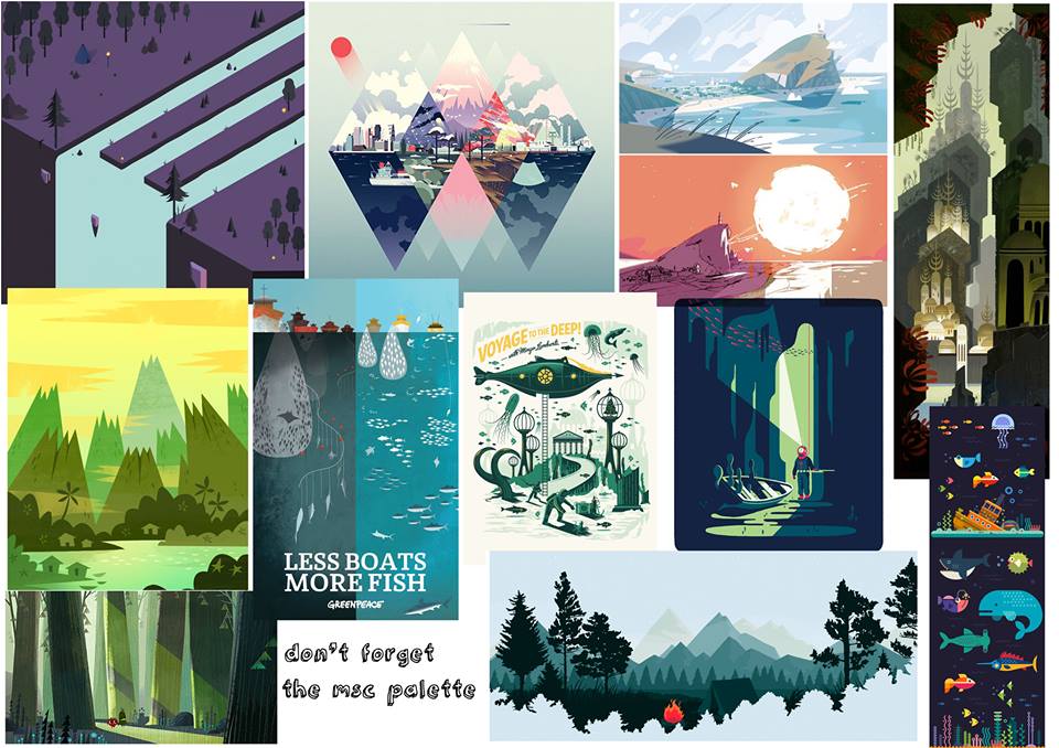
After looking at the mood boards and research that the other members of the group had done I decided to go down a slightly different route for the environment backgrounds and use more geometry rather than abstract shapes. 

 
Initially I went for a very friendly look with lots of rounded corners and shapes and hardly any straight edges at all. Personally I really liked this idea because it reflects the tone of voice of the animation into the actual design itself. When I showed my peers they liked it however they felt that it was lacking a little. They told me that the environment needed to be made up of 3 different parts, one long section spanning vertically for the first pan of the animation, a section panning horizontally across the ocean floor and finally another section going down vertically for the deeper part of the ocean. This complicated things a little as the canvas would be mostly empty a part from a funny zig zag shape.

So I redid the environment in 3 different pages if you will. The pan down section from the horizon to the bottom of the ocean, the pan across section from the ocean floor across past our different areas of interest and then finally the pan down further section into the deep sea for the angler fish. 


I started working on the bottom ocean floor section first as I felt if I got this section right it would be easier to apply it to the other sections that needed to be done. I started off very paired back and simple as to not draw away from any of the animation. But the feedback that I got was that it needed more texture and depth.


Also when I showed the gym equipment, initially the animators wanted them to be at an angle however they found that this was hard to animate with in 2D so I had to change these to be from a side on perspective. 

For some extra texture I experimented with Brusho, which is a medium that I have not used before. The way the powder separates and spreads in the ink creates these fantastic colours and shapes that couldn't be replicated in any other way. This definitely could make the water look more like it is underwater rather than just a blue background which I feel that some of my original textureless backgrounds felt like. 


Though the brusho looks really effective, bright and colourful on its own when it's applied over the background it feels a bit out of place. Maybe its because everything else has a flat vector look, having something that is traditional media over it doesn't fit. So I'm going to try and experiment with vectorised textures. 


I started by adding some wavey shapes to make the water feel less like a backdrop and more like water. I also played around with the depth of the image by adding different layers of sand in both the foreground and the background. 


I also started to work on the theme park. I tried here to add quirky yet subtle touches to make it humorous for the audience. For example on the merry go round I used seahorses instead of normal horses and for the carriage for the rollercoaster (not pictured here) I named the rollercoaster "Poseidon's Big One". I hope that this friendly and funny tone of voice attracts the audience of 18-25 year olds.


So here was the first draft of sorts of the horizontal environment. Each time I get to a stage like this I upload the images onto a shared google drive so that everyone can see it and critique it. But I am pretty pleased with the resulting environment so far, I feel like it is not too overpowering to take over the animated divers yet sets the scene nicely.


Afterwards, I also altered the gym scene to fit the animators requirements and again for a bit more depth I've added some background elements to fill the scene a bit more. 

After finishing the horizontal section I felt more confident in applying the feedback that I had got from that to the first vertical section. In this section I tried to add a bit more life to the design by adding some fish in there, but they had to be removed in the end because they wouldn't be able to animate them. 


After having another meeting with my group they said that all of the backgrounds needed a lot more texture so I took them into photoshop to use texturised brushes. This meant that the environments were lower resolution as vectors but it allowed me to do a lot more with the brush tools. 


I added a lot more depth on the piece through the use of gradients and various grunge styled brushes. I'm really surprised with what a difference this has made from the flat environment to something that looks more 3D almost. 

I also went back to my horizontal environment and finished it off in Photoshop too in order to get a more textured and interesting design. As well as this I added a lot more objects into the background like rocks and seaweed to make the bottom of the ocean feel more alive. 


Now that I am confident with the backgrounds so far I just had to work on the deeper version. This is where the rollercoaster drops down further into the ocean to pan to the angler fish shot. This was possibly the easiest environment to do because it simply faded to black. 

OUGD503 - Studio Brief 1 - Goat Collective Brief Research

After sketching out some initial ideas for the goat collective brief I decided on going down the typographic route. I want to create a letterpress poster using a powerful quote to highlight waste in our society.


The first artist that came to mind was Anthony Burrill. His work is the epitome of bold and powerful typography. The type that he choses to set his text in is a very traditional sans serif that was used a lot on old posters when letterpress was more popular. It almost makes it seem like a poster for the government as the typeface gives a very official feeling to it. I suppose this adds to its commanding and in your face nature.


This letterpress printed poster was created to celebrate the one year anniversary of 20x200 an online gallery of affordable art. Designed and printed in 3 colours using wood type and existing printer's cuts and ornaments. I really like the use of the background elements here, I could try and replicate this with mono printing techniques. However I do feel that the mixture of colours and illustrations behind the text distracts from the main type. The type would look a lot more bold and powerful if it was on its own. 


This print struck my eye the most. I absolutely love how they have replicated a smudge within the design. I think for my piece I will definitely experiment with doing something different like this to make it stand out from the crowd. Although I think that this has been screenprinted, I could try spraying oil onto the type when inked up to smudge it like this. 

Monday 8 February 2016

OUGD503 - Collaborative - Environmental sketches

It was decided that me and the illustrator should focus on the environment and character designs as we won't be able to help much when it comes to the animation part. I picked to do the environmental designs as I felt that this would suit my style more. 

I did some initial experiments in photoshop using textures and various abstract shapes. I thought that these might be a little too abstract for the animation but we still don't have a full outline of the animation yet so I can't do that much for the moment. 


I think that this was my personal favourite out of all of them just because of its simplicity. I like the use of the textures instead of block colours as a backdrop as this will make the characters and animation really stand out on top. 


I also played with the thought of doing something isometric. Looking into what's happening in a square bubble of sorts a lot like the portal advert that is inspiring our idea. This would be really difficult to create full environments for though, it would be easier to do in a 3d software but I wouldn't know where to start. 


After showing these initial ideas to the rest of my responsive group I was surprised to find that they liked them a lot. I thought that they would be a bit too abstract and paired back for what we were thinking. However they had come up with some mood boards for the style of the animation and a lot of the illustrations that they had shown on these were a lot more complex than what I had created. 


A lot of the environments use lots of geometric shapes and different shades in order to create depth. They are also primarily vectorised illustrations with little traditional media used. I had also found an environment illustration that I thought was quite charming, so I used a combination of these to inspire my next environment designs. 

OUGD503 - Collaborative - Narrative

Today I met with my responsive collaborative practice group in order to finish the narrative of our animation. After many ideas of what we wanted to do we finalised on an idea. To go down the positivity route we decided that an animatic showing divers physically looking after fish in the oceans with a bit of a spoof twist would work well. Initially we wanted to do this within a laboratory environment yet this would not have fitted in with the MSC ethos. This idea was heavily inspired by the series of portal 2 adverts which were sort of like infographics showing the laboratories within the game. We thought that the friendly yet comedic overtone would really speak to the aspirational young target audience. 

So we decided to set it out in three different sections to show how the MSC care for the fish in the oceans. The first section was to show that MSC labelled fish are healthy and strong, so as a funny twist on this we decided to show fish in a "gym" underwater. The second was to show that they are saving fish for future generations of fish so we decided that we could simply show lots of generations of fish. And where do lots of different ages of people go? The theme park! Finally, we wanted to put across that MSC labelled fish helps the environment. Initially we struggled with this one because it is pretty hard to portray in a comedic way. However Oscar and Ollie came up with the idea to use an Angler fish (fish with lights) and have a diver trying to replace its light with an energy saving bulb.