Saturday 30 January 2016

OUGD503 - Studio Brief 1 - Ecosystem Forums

After coming up with the ecosystem club idea I thought it would be best to create a forum that members could use in order to get in contact with each other. Even though I want to encourage relationships off screen people will still want to contact each other when they are in the comfort of their own home. I kept the design quite simple and paired back in order for people to navigate the site easily. Also I stuck to a minimal colour scheme that suits my other design materials.


OUGD503 - Collaborative Practice - MSC - Advert Research

After the initial meeting with my group I decided to try and look into some ad campaign videos to inspire me and get to grips with what we could do for the MSC.

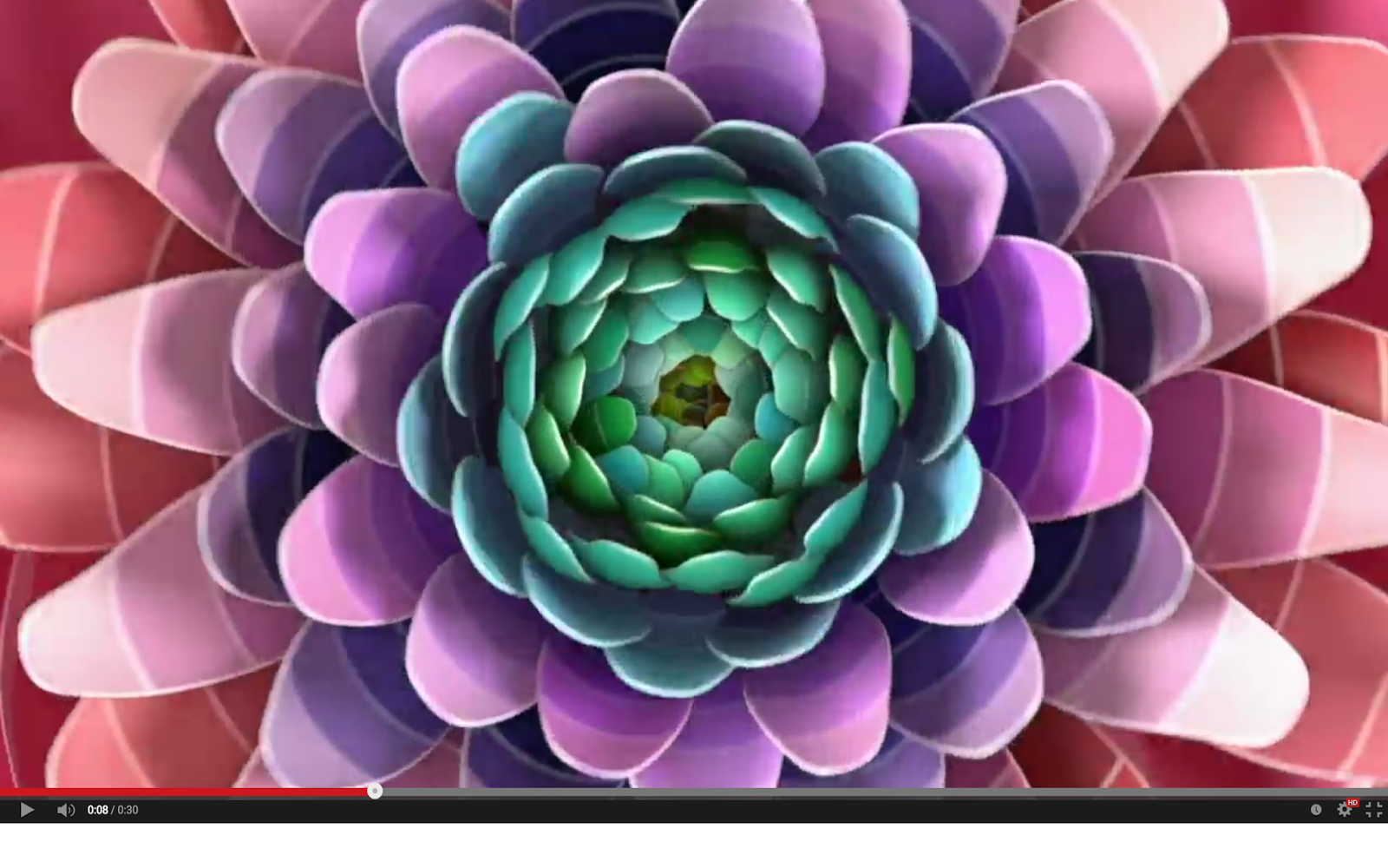
The first advert that I came across was this purely visual Dulux advert, showing their wide variety of colours through shifting shapes, starting off like a kaleidoscope then turning into objects, plants and animals. This is really effective at portraying the variety as the colours blend and fade into gradients almost. I like the idea of having a quite abstract advert like this showing the benefits of MSC fishing.


Watch here:
http://webneel.com/video/kaleidoscope-3d-animation-short-film for dulux paint

As a group in our first meeting we looked briefly at the Portal 2 adverts which were designed to look like they were made by a company within the game, advertising that rather than the game itself. We liked the tongue in cheek approach to this, using simple stick figures and infographics to make people smile. I'm not sure how this would apply to MSC as of yet but it would definitely tick the box of a positive campaign.


Tuesday 26 January 2016

OUGD503 - Penguin Cover Competition - Final Book Cover and Submission


I am really pleased with the outcome of this book cover. I feel that it fulfills the brief really well as I have included a mixture of tradition and humour with a contemporary vibe. So far within the responsive module this has definitely been my favourite of all the briefs that I have chosen. This might be because I got to explore my illustration a bit more than in the other briefs. It definitely makes me want to continue to create illustrations whether as parts of other briefs or just for my own personal development. My time management throughout this brief has been a bit scattered, some weeks I have managed to work a lot on this brief and others I have left it alone completely. But I still finished the brief well before the deadline of the competition so it wasn't detrimental to anything that I took a bit longer than expected on this brief. 

Looking back at this brief as a whole I think that my performance has been very good due to the fact that I got lots of feedback which helped me along the way and also helped to make the design what it is. This has taught me the value of good and honest feedback, without it I think my design would be lacking so it is something that I will look for in future briefs. 

Monday 25 January 2016

OUGD503 - Collaborative Practice - Meeting with my Group

Today all of the group met up in the canteen to discuss our ideas for the brief so far. Initially we all hadn't really come up with much, however I had created a mind map with some of my ideas that I had thought of.

My favourite idea was to play on the idea of "eating responsibly" so like alcohol adverts have drinking responsibly connotations these adverts could take this idea and twist it to apply to food in a playful way.  There was one animation that I found in particular that was exactly the vibe that I thought would work for this concept. I have linked this below:

However when pitching this to my peers they said that it may be a bit corny and childish - not reflecting the target audience of 18-25 year olds. I have to admit I was rather disappointed with this as I thought that it was a really good idea in comparison to the others however this is one of the challenges of working with other people. Everyone has their own opinions and we have to compromise.

After bouncing a few ideas off of each other we ran to a bit of a stop. So I suggested that we create word associations from the company itself. I came up with a few ideas that I had never thought before that could be used in word play such as being 'trapped' or 'hooked' on unsustainable food and that eating MSC releases you from this way of life.

While mind mapping and creating word associations I was very aware that all the ideas that we were coming up with were leaning towards the negative side of the fishing industry and the brief distinctly says not to do this. So I wrote out the Do's and Don't's of the brief and realised that the message should specifically be positive, relevant to the audience and be emotional. While not shunning the fishing industry or creating a dooming image of over fishing.


Wednesday 13 January 2016

OUGD503 - Studio Brief 2 - Creative Partnership Agreement


OUGD503 - Responsive - Paper craft/cut Research

After having a critique about my initial ideas, showing some of my poster ideas I thought it would look more effective using paper cut. Also it would really bring the elements of the letters to life.

The first artist that I found particularly inspiring was Julianna Szabo's work as she created a series of letterforms out of paper building them up through the different objects associated with the theme. Her paper cut pieces are so intricate and I really like how she sculpts the paper as well as cuts it to create a 3D letter rather than something that is just flat on the page. 


The Snask design of the Printing Friends cover was initially what inspired me to create the type posters. The rainforest type theme really matches the ethos of WWF so I wanted to try out something similar. I love the atmosphere that the mist creates - pushing it that bit further to make it seem like the letter is actually in the rainforest. 


The contrast between the colourful plants and creatures with the black and smoky background really brings the piece to life. Almost like someone had stumbled upon it in the middle of the rainforest. 


Helen Musslewhite


With Helen Musslewhite's work she cuts out flat pieces of paper and layers them together in order to create the depth and 3D feel. By using different coloured and patterned stock it really emphasises the depth and makes the environments that she creates look more real like you could step into them. 


I particularly liked this piece with the fox because of the subtle folds that she created within the leaves. The shadows that the folds create add that more bit of realism and depth. Also the framing of this is particularly nice with the leaves drawing your eye around it and then into the very heart of the piece. 

Sunday 10 January 2016

OUGD503 - Individual Practice - Eurojust Final Submission


Final Logo


"The logo comprises of the main colours of the European union to unite it to all of the countries within it. The image of the scales represents justice, being balanced by the word ‘Eurojust’ itself, meaning that Eurojust as a company creates balance within the EU. The use of the capitalisation of the letters adds power and security to the brand, making it trustworthy. The combination of the traditional scales with a contemporary sans serif typeface shows that the company has stood the test of time, transcending any barriers."

I don't know how I feel about the final logo - while it is successful I don't think that I will win the competition because it is too generic. I think that a lot of the entries will consist of the scales of justice and while I have used a unique way of combining them with the name it still will be overlooked. This brief has made me realise that logo design might not be my forte. I definitely have a lot to learn when it comes down to it.  In terms of my time management for this particular brief I also feel that I could have done better. For just a logo design I spent about a month creating it. This definitely could have been shorter but I sidetracked this brief while doing others when I should have just finished it as soon as possible. This might be the reason I feel so disheartened by the design itself, it got to the point where I didn't know what to do with it so I just submitted it.

If I was to re do this brief I think I would spend more time in the initial ideas phase, looking at other logos for inspiration and really trying to come up with a more original idea.

Saturday 9 January 2016

OUGD503 - D&AD - WWF Brand Book

When searching the website for WWF I found an example of their brand book. This helped me to see how their current designs work and I actually learnt a bit more about the company itself. After looking at their image heavy poster campaigns it makes me want to do something that diverges slightly from their normal designs. What was particularly helpful though was their brand values - it will help me determine which directions will be best to take within the campaign.


 http://awsassets.panda.org/downloads/wwf_brand_book_2.pdf

Saturday 2 January 2016

OUGD503 - Studio Brief 1 - WWF - Concept

After looking more into the brand and talking through some of my initial ideas with my tutor I have decided on a concept. I will create clubs within the WWF community called ‘Ecosystems’ where members can meet up and do volunteering activities to help their own environments where they live as well as fundraising for the greater cause of WWF. 

Because most communities for charities these days are online these days taking the membership away from the computer screen instantly will make people more active within their communities. Relationships will become real and not just text on a screen. Therefore for the concept I will focus on making a memberships a community rather than an online social network.