
Looking at the original book cover I don't feel like it portrays the fact that this book is humorous at all. The dark colours contrasted with the silver embossed type makes the book feel sophisticated and quite traditional, which in reality from reading bits of it, it isn't really. Moran's tone of voice is friendly, easy going and has a cheekiness to it. She talks to the reader as if she is talking to an old friend. She leaves no details spared however cringe-y they may be about her awkward childhood years. So I knew immediately that I wanted to do something that was a bit of fun, with a tongue in cheek element to it.

I had the crazy idea of drawing Caitlin Moran in famous portraits of women, like above I have drawn her as the "Girl with the Pearl Earring". This twists these classic portraits into something that is quite humorous as Moran has a way with pulling silly faces. So adding her face onto the traditional portraits creates something quite funny looking. Below are some of her silly faces that I found:


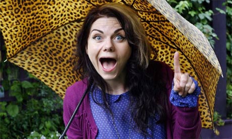

She never seems to pull a straight face in photo shoots which to me says a lot about her personality and therefore should be reflected on her book cover.

Two other paintings I thought would suit well was the Mona Lisa and The Birth of Venus. However as soon as I drew the birth of venus I knew this was what I wanted to do. Because I could twist the painting in such a way that Moran is being exposed, like in her book how she exposes all of her embarrassing details, on the cover she exposes her body in a way. This paired with one of her cheeky faces doesn't fail to make me smile so I hope that it has the same effect on prospective readers.
No comments:
Post a Comment