Friday, 13 November 2015

OUGD503 - Responsive - WWF D&AD Brief

When looking through the YCN and D&AD briefs this brief stood out to me the most because I am very passionate about the cause. I love animals and I am quite passionate about stopping global warming both of which WWF promote strongly. The brief itself is about trying to bring together the community of subscribers to be more active and involved than just paying a certain amount of money each month. It is further highlighted in the "What's Essential" section:

Whats Essential:
- A product, service or campaign idea to turn young WWF members into an active conservation community. 
- Document and show your research and how you developed your ideas. 

So instead of reading this as a full brief it is easier to create a question that you can answer with your solution. From reading the brief it is clear that the question should be: 
What can current members to do to make an impact and how can the membership become more rewarding?

After having a tutorial with Simon to talk about some of my initial ideas it became a lot clearer to me that the brief wasn't just about making membership more rewarding for the members but it was about them forming an active community. These two words in particular are key in this brief and tell me a lot about what my solution should be.  

INITIAL IDEAS


I made a mind map of all the ideas I had in my head to answer this brief. I especially like the idea of calling the communities that would be created "ecosystems" as it is defined as a biological community of interacting organisms and their physical environment. Which could be read as a community of people interacting to help their physical environment. From this terminology I could do a lot with biological terms, such as having food trees. This really interests me because I studied biology at A Level and I was especially interested in any biology that was animal or ecosystem related.

I also want to focus on a more down to earth campaign. I feel that today too many things are based purely online and I think this may be the reason why the current WWF community is lacking in an active membership.

Also the partnerships with other companies mentioned in the brief could open up lots of possibilities within the community and it is definitely something that I will think boost the communities activism.

Wednesday, 11 November 2015

OUGD503 - Penguin Cover Competition - Development

After sketching out some ideas of the traditional portraits I moved onto digitally developing them where I came up with a few more ideas along the way. 

I thought of also transforming her into one of her role models: Frida Kahlo as she mentions in the book that she is one of her idols so I thought that it would be a good play on it to make her into one of her 'heroes'. I found the iconic portrait of Kahlo and decided to simply add her face onto her. 


I found that this looked a little odd. I was trying to stick to a minimal colour palette to keep it more contemporary, playing with monotone and splashes of colour in her accessories, lips and eyes. But it seems too serious for the book, it just looks like she is posing for a portrait rather than being an equal to Frida Kahlo which was what I was going for. After mocking this up digitally I don't think that I will carry on with this idea. 


The Birth of Venus


My favourite idea was including her into "The Birth of Venus" painting. To add more comedic value to the piece I decided to add a 'shocked' face as well as her iconic hair to the figure. I thought that this would show both the traditional and comedic vibes that penguin were looking for on this cover. 


I also added some underwear in a cheesy leopard print to make it a bit more funny rather than just having the hair cover her. However after having a critique with my tutor he said that the underwear made it a little too wacky, and that based on my research where the type is factored into the design I should do the same rather than having it floating above her head. I had tried using ribbon like in the book covers I research however this still felt a bit lost in all of the detail. I needed something simple to contrast the flat yet detailed illustration.   


So I took off the underwear and added 'censorship' bands over her privates and put the text on these. I feel like these work really well because it is a bit tongue and cheek just like the book itself and it isn't being over feminine with the typeface choice. The red is definitely a stronger contrast than the black censorship bands as it draws the eye to it and makes the cover more poppy. 


Next I decided to take the design even less feminine by adjusting the background colour from the baby pink. I feel like aiming this book at women through the stereotypical colours goes against what Caitlin Moran believes and it shouldn't be a book marketed to just women as I imagine men would enjoy it too.  So I looked at the painting once more and decided to pick a colour similar to the colour of the sky and the see. The red and this blue combined really make the cover a lot more eye-catching. 


Once deciding on the main type placements and illustration I moved from just the front cover to the whole wrap around for the book. Initially I found it really difficult to place all of the text on there without taking away from my illustration. Especially with the review text, it felt placed on and not integral to the design. Also the blurb on the back cover feels a little static too but I will wait until my next crit to see how I can add some dynamism. 

Saturday, 7 November 2015

OUGD503 - Responsive - Studio Brief 1 - Eurojust Logo Initial Ideas


Initially when I looked at the Eurojust brief I immediately pictured the Lady of justice. So I did some initial quite illustrative sketches of her while combining the star to show the emblem of the european union. Also I thought of shields to represent how the eurojust organisation protects people from crime. All of these feel very stereotypical and slightly cliche but I feel with some digital development they would look quite contemporary giving the logo the little lift that it needs.

I started out with the very simple portrait silhouette of the lady of justice, replacing the eye with a star to represent the eurozone. I feel like this doesn't really look like much to do with border control and prevention against organised crime, it is too conceptual in a way. 

Next I tried the half face idea for the lady of justice with a star in place of her eye. I thought that this could show that justice sees through all and prevails. However I don't feel like this needs the text underneath because it doesn't really line up very well and distracts from the concept.

Then I went on to the scales because they have these in their current logo design I feel like not changing the design too much will work in my favour. So I started out with a very simple set of scales set over the name of the company in a bold sans serif to show power and stability.


I then had an idea to make the 'U's of the name into the scales themselves and using the 'O' as a centre point. At first I just had them sort of hovering over the u's but then I realised I could connect them to the opposite ends if the u which I find makes it look a lot more balanced. The bold, straight lines show strength and rigidity in the company which is what people look for in judicial and border control companies. 


Wednesday, 4 November 2015

OUGD503 - Penguin Cover Competition - Book Cover Research

After coming up with some initial ideas and reading through the brief I knew that I wanted to create a cover with a more illustrative look and feel to it. One illustrator that I found particularly appealing was Perrin whose illustrations combine flat colour with intricate line work to create a gripping composition. The way the intricate branches wrap around the text draws your eye into the main subject which is the cheshire cat and Alice herself falling. 

http://madebyperrin.com/Book-Covers

I love the simplicity of the black silhouetted illustrations against a pastel coloured background. The hand written elements add a personal feel to the covers of the books. This might relate to ‘How to be a Woman’ because the subject is basically like a journal of Moran’s life. Also the minimal colours make the cover not too overpowering. 


With this design I love how it plays with the title, not having a simple linear title gives it that extra boost of interest to the cover making people want to pick it up. I also really like the subtle little illustrations surrounding the title in the frame as it gives hints to the story. Perhaps if I do end up reading the Caitlin Moran book I should include hints to the story that are prominent. 


Tuesday, 3 November 2015

OUGD503 - Penguin Cover Competition - Initial Ideas and Sketches


Looking at the original book cover I don't feel like it portrays the fact that this book is humorous at all. The dark colours contrasted with the silver embossed type makes the book feel sophisticated and quite traditional, which in reality from reading bits of it, it isn't really. Moran's tone of voice is friendly, easy going and has a cheekiness to it. She talks to the reader as if she is talking to an old friend. She leaves no details spared however cringe-y they may be about her awkward childhood years. So I knew immediately that I wanted to do something that was a bit of fun, with a tongue in cheek element to it. 


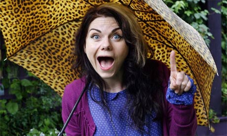
I had the crazy idea of drawing Caitlin Moran in famous portraits of women, like above I have drawn her as the "Girl with the Pearl Earring". This twists these classic portraits into something that is quite humorous as Moran has a way with pulling silly faces. So adding her face onto the traditional portraits creates something quite funny looking. Below are some of her silly faces that I found:


She never seems to pull a straight face in photo shoots which to me says a lot about her personality and therefore should be reflected on her book cover. 


Two other paintings I thought would suit well was the Mona Lisa and The Birth of Venus. However as soon as I drew the birth of venus I knew this was what I wanted to do. Because I could twist the painting in such a way that Moran is being exposed, like in her book how she exposes all of her embarrassing details, on the cover she exposes her body in a way. This paired with one of her cheeky faces doesn't fail to make me smile so I hope that it has the same effect on prospective readers. 

Monday, 2 November 2015

OUGD503 - Responsive - Studio Brief 1 - Eurojust Logo Competition Brief

Theme: 

Eurojust, the European Union’s body for judicial cooperation against serious and organised crime, is launching a contest for a tentative logo and graphic identity. The aim of the contest is to consider a possible update of the Eurojust logo, to make the body more distinguishable and recognisable to its stakeholders1 and the general public. 

The contest offers in particular students of art, graphic design, design, and architecture an opportunity to perfect their skills by participating in a creative project which should help them continue their studies or professional careers in the fields of visual arts, design and fine arts. 

Aim: 

The aim of the contest is the development of a tentative new distinct logo proposal for Eurojust. The logo proposal must incorporate one or a few key elements of Eurojust’s mission, i.e.; 

what we are: the European Union’s judicial cooperation body, 
the problem: cross-border crime what we do/the solution: coordination, cooperation, fighting serious organised crime, justice, centre of expertise. 
our values: the rule of law, justice, safety, security, serving Europe and the EU Member States, connecting judicial actors, 
the result: less crime, safer society 
List of key elements to be conveyed in a new logo: cross-border crime, coordination and cooperation between EU Member States with different cultures and legislation, serious organised crime and justice/judicial cooperation. (This is only to guide which are the key ones; not all necessary elements in a logo.) 

In addition, the European Union flag symbol, should be used, according to the guidelines for this. See Eurojust’s website www.eurojust.europa.eu for more inspiration. The design proposal must have the word ‘Eurojust’ clearly displayed in the logo, and should also include a pictorial symbol. Participants have to make combinations of some of the elements mentioned above to give a proposal to encapsulate Eurojust’s mission and role optimally.

Background:

The present logo was adopted in 2003. Since then, the organisation has evolved, and become bigger, and more mature; its establishing act (Council Decision 2002/187/JHA) has been revised several times, more Member States have joined the EU, and the demand for more judicial cooperation to fight organised crime has gradually increased. Moreover, the organisation expects to have a new forthcoming establishing regulation adopted in the near future, and will move to new premises in 2017. So, the organisation stands before a momentum of major changes. 

Therefore, the College of Eurojust, composed of the representatives of the 28 EU Member States, has granted a College Working Group the task to explore what a potential, new Eurojust logo could look like, to better reflect the organisation in 2016 and beyond. Thus, the first requirement is a clear logo proposal for better branding and positioning of Eurojust, notably as it expects to have its forthcoming new regulation soon, and will move to new premises in The Hague in 2017. One means to conduct its work against serious, organised cross-border crime is to articulate its mission and role, achievements, and/or results with a clear visual identity in its logo. A new, clearer and more modern logo would offer numerous possibilities for reaching out to our stakeholders, reflecting our expected new, forthcoming mandate. 

The tentative logo design proposal, subject to acceptance or refusal by the College of Eurojust, is to be developed through a Logo Design Contest. Wide publicity will be given to the contest through release of an EU-wide contest for a prize to ensure that the information reaches and encourages creative minds to participate in the competition. 

Award criteria: 
- The logo proposal represents Eurojust’s mission and ensures recognisability of the basic aims
- uniqueness of relevant design and originality
- its positive and clear visual impact, aesthetics
- its suitability as visual emblem of Eurojust, in terms of design, colours, font, and adaptability for use in different media, and all-round applicability

Deliverables:

- Each logo graphic must be provided in EPS format (vector), using the CMYK colour model

- In addition to the compulsory EPS file mentioned above, contestants should provide each logo in the following file formats, resolutions, and sizes: 
* JPEG, PNG 
* In high resolution (at least 300 dpi) for print 
* In low resolution (72 dpi) for web 
* 50 pixels in width or height; 100 pixels in width or height; 600 pixels in width or height

- Contestants must indicate any typeface/fonts used in their design, ensure that these are legally allowed to be used by Eurojust, and define any licensing rules that may apply or restrict their use. 

- Contestants should not imprint or watermark any of the contact details in the proposed logo design. 

- Contestants should submit a written description (of no more than 200 words) of their design(s), explaining its graphic identity along with other relevant information such as the programme they used to create it, the colours used (CMYK colour codes, and their equivalents in RGB and HTML), typefaces/fonts used , and any other important facts.

Sunday, 1 November 2015

OUGD503 - Studio Brief 1 - Penguin Random House Publishing Caitlin Moran - How to be a Woman

The Brief:

We would like you to design a new, classic cover for Caitlin Moran's book, How to Be a Woman.

The design needs to feel timeless and classic, whilst at the same time making it clear to the reader that it is very entertaining and often very funny. The book should feel very accessible, immediately ‘pickupable’ and something that exists within the world of Popular Culture. You are welcome to use an image of the author, but do not feel that you need to take that approach.

The ideal design will make us smile, make us want to own a copy of the book, and keep it proudly on our shelves for a long time.


What the Judges are Looking For:

We are looking for a striking cover design that is well executed, has an imaginative concept and clearly places the book for its market. While all elements of the jacket need to work together as a cohesive whole, remember that the front cover must be effective on its own and be eye-catching within a crowded bookshop setting. It also needs to be able to work on screen for digital retailers such as Amazon.

Your cover design needs to include all the cover copy as supplied and be designed to the specified design template (B format, 198mm high x 126mm wide, spine width 20mm).


The winning design will need to:
  • have an imaginative concept and original interpretation of the brief
  • be competently executed with strong use of typography
  • appeal to a contemporary readership
  • show a good understanding of the marketplace
  • have a point of difference from the many other book covers it is competing against
  • be able to sit on the shelves of a supermarket or ebook store as easily as it sits on those of more traditional bookshops.

From looking at this brief and the book itself it is immediately clear that they want something that is humorous and eye catching. I think I will try to read at least half of the book to get the general idea of the humour and the books ethos so I can translate this into the design. I also want to try and explore my illustration practice within this brief, so I already know that I will try and explore more illustrative designs.