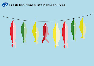
I had quite a few creative ideas for how to advertise MSC fish, most of them involved pull off recipes. My first idea was to have big fish installations in relevant areas such as markets and supermarkets where each scale on the fish was a recipe. However I thought that this might not be that viable because it would require a large space for it to be placed which some shops might lack. So my second idea was to have 'fish' hanging off a string over the fish counter so you could "catch" a recipe by pulling a fish off the rope.
A made a little mock up using some of the fish that the illustrator, Tom, had drawn for the animation. I showed this to the rest of the group and they really liked the idea. They also suggested that if I had time to create a series of posters that show different scenarios that we couldn't fit into the 30 second animation. I decided I would try this if I had time to spare but this was the more creative "out of the box" idea for a supporting campaign so I continued to develop it further.
With the help of my peers I narrowed my designs down to three fish that are most popular among the 18-25 target market which are: Tuna, salmon and cod. So I started to develop the designs for these. Using the fish that had already been drawn I chose ones that were similar to the look of the fish and colour coded them with appropriate colours.
When I showed these designs to my peers they said that they were a tad on the plain side. I do agree with this as because they are now static rather than moving they could have a bit more detail to make them feel more alive.
So using various artistic effect brushes in illustrator to create scales and a bit more detail. I think that this works really well as it makes them look more 3D as well. So I decided to look for some recipes to put onto the back of the fish.
Initially I found it really difficult to fit the recipes onto the strange shape of the fish, I tried using an oval shape to fit the text into but it just didn't work. So I resorted to using columns. The only down side about this is that there isn't really enough room for any illustrations or photographs of the food they are cooking. Hopefully 18-25 year olds will have a good imagination!
This was the final product. I thought that they looked really effective all hung up on the string and it would definitely tempt me to grab one. If I had more time with this I would have mocked up the fish properly within the context of a fish shop but due to the deadline nearing I will have to leave it with these photos.
I also managed to mock up a poster idea, I tried replicating the tongue in cheek aspects of the animation with a quirky looking speech bubble. I only managed to create the one scenario of some divers tucking in a fish in a "bed". Again if I had more time I would have done a couple more designs but I did manage to mock it up in context which I feel makes the design look a lot better.


No comments:
Post a Comment