Thursday, 14 April 2016

OUGD503 - End of Module Evaluation

Overall this module has been my favourite so far this year because of the fact that I could choose which briefs I wanted to do and when. It has made me a lot more independent in seeking feedback as well as organising my own time. This makes me feel more confident for 3rd year because all of the briefs will be self initiated in this manner. Also I have learnt so much about the importance of presentation for future clients. I feel a lot more confident as a designer for being able to produce successful presentation boards as well as writing them in an appropriate manner.

Because I have enjoyed most of the briefs within this module I feel like I have spent more time on it than I would a normal brief. I challenged myself with extra tasks for my small briefs and even though nothing came of it I have learnt from them. But I feel like my time management could have been improved, some briefs like the WWF brief and the Penguin Design Award brief I spent far too much time on when I should have been working on other things. But because of this I think that these two briefs were where I created my best work for this year. I still managed to complete all of my briefs with time to spare before their respective submission dates so it wasn't too detrimental to my practice.

In Collaborative Practice I really enjoyed working and meeting people on other courses. It made me have an insight into each of their design processes and I have learnt new things because of this. Additionally I am more intrigued by animation now, perhaps I will try this next year within one of my briefs.

One thing that I regret not doing within this brief was to not explore my printing practice more. I only traditionally printed one brief, but I would have liked to do more. Also in hindsight I would have liked to do some packaging designs as I haven't really approached packaging design this year after doing so much of it last year. I have looked on at others doing the packaging briefs in envy so I think this may be something that I take forward to 3rd year. 

OUGD503 - Studio Brief 3 - Project Report

OUGD503 - Studio Brief 1 - Small Briefs Design Boards


OUGD503 - Studio Brief 1 - WWF Design Boards


Wednesday, 30 March 2016

OUGD503 - Collaborative - YCN MSC Submission Boards


Overall I'm really pleased with the outcome of our collaborative group. I found it quite beneficial working with other courses just to see their design processes and how they work in general. It also meant making contacts for the future if I need an illustrator or an animator I will have people who I know I can trust. Also I think it helped that at the start of the project we all set each other roles to do within the animation and design campaign, and the time plan that the animators created was a huge help in knowing when our roles had to be done by. 

I feel that as an individual I did quite well within the group as often in meetings I would sort of take control a bit to sort out what we were doing. Also I feel that I did a lot of things for the animation as the environments were a large part of it as well as producing some design work for it afterwards as well. I got everything done by the allotted time deadlines and we managed to submit as soon as the animation was finished because of this. 

OUGD503 - D&AD Submission - WWF Membership as Community


I think that this brief has taught me a lot in terms of doing competitions as well as developing my own skills. I tried lots of new techniques like paper cutting which I've never really attempted before and found out that I really like doing it. Also I've never really come up with much conceptually before so I feel more confident in portraying a concept and following through with it in the designs. But I feel that the most important thing that I have learned during this brief is how to write about my work confidently for submission. This is a skill that will come in handy especially next year and when I am creating my portfolio. 

I am really pleased with the visual outcomes too. Like I mentioned before, paper cutting was something that I hadn't really attempted before and I found that I have a knack for it. So this is something that I would like to carry over to other briefs. If I had more time I would have definitely tried to create a stop motion advertisements for the ecosystem clubs. Although I feel my concept is strong so it is pretty self explanatory. 

My time management in this brief has been alright but could have been better. I did spend longer than I probably needed to on this brief, a lot of the time was spent adjusting and re adjusting the presentation boards for submission however I feel that this worked out for the better. 

Sunday, 20 March 2016

OUGD503 - Collaborative Practice - Supporting Design Campaign

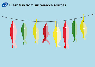
I had quite a few creative ideas for how to advertise MSC fish, most of them involved pull off recipes. My first idea was to have big fish installations in relevant areas such as markets and supermarkets where each scale on the fish was a recipe. However I thought that this might not be that viable because it would require a large space for it to be placed which some shops might lack. So my second idea was to have 'fish' hanging off a string over the fish counter so you could "catch" a recipe by pulling a fish off the rope.


A made a little mock up using some of the fish that the illustrator, Tom, had drawn for the animation. I showed this to the rest of the group and they really liked the idea. They also suggested that if I had time to create a series of posters that show different scenarios that we couldn't fit into the 30 second animation. I decided I would try this if I had time to spare but this was the more creative "out of the box" idea for a supporting campaign so I continued to develop it further.

With the help of my peers I narrowed my designs down to three fish that are most popular among the 18-25 target market which are: Tuna, salmon and cod. So I started to develop the designs for these. Using the fish that had already been drawn I chose ones that were similar to the look of the fish and colour coded them with appropriate colours. 

When I showed these designs to my peers they said that they were a tad on the plain side. I do agree with this as because they are now static rather than moving they could have a bit more detail to make them feel more alive. 


So using various artistic effect brushes in illustrator to create scales and a bit more detail. I think that this works really well as it makes them look more 3D as well. So I decided to look for some recipes to put onto the back of the fish. 


Initially I found it really difficult to fit the recipes onto the strange shape of the fish, I tried using an oval shape to fit the text into but it just didn't work. So I resorted to using columns. The only down side about this is that there isn't really enough room for any illustrations or photographs of the food they are cooking. Hopefully 18-25 year olds will have a good imagination! 


This was the final product. I thought that they looked really effective all hung up on the string and it would definitely tempt me to grab one. If I had more time with this I would have mocked up the fish properly within the context of a fish shop but due to the deadline nearing I will have to leave it with these photos.


I also managed to mock up a poster idea, I tried replicating the tongue in cheek aspects of the animation with a quirky looking speech bubble. I only managed to create the one scenario of some divers tucking in a fish in a "bed". Again if I had more time I would have done a couple more designs but I did manage to mock it up in context which I feel makes the design look a lot better. 

Tuesday, 15 March 2016

OUGD503 - Responsive - Final Crit

For the final critique I showed my final presentation boards for the WWF D&AD brief as I wanted to have them checked before submission. I couldn't really show much of my collaborative as we had already decided on all the environments that I had done and the animators are in the process of animating it all so there wasn't anything to show really. 

So I asked some questions about the WWF boards and these were the responses:

Is the concept clear enough, if not why?
- Absolutely! Great way for members to engage and collaborate with other members. Effect and more engaging for new members to go along for talks and meetings
- I think the concept works really well as its a good way to make the community grow.
- Yes, great way to bring the members together and take action
- Very clear concept that achieves the aims of the brief
- Yes its a great way to bring in new members together.
- The concept is clear and definitely helps in igniting an active conservation community.

Do you feel like the design material is relevant to the concept/brief, why?
- Posters are Super. Nice as collectables for members
- Yes all the materials works really well especially the posters look really engaging. The design works well and gives the feel of a WWF material.
- Yes, nice use of the colour green & good that materials make use of recycled materials - completely relevant!
- Very relevant, bright blues and greens which relate to nature
- Love the use of colour in the posters, really eye catching and exciting. Posters work really well.
- They help to put the power into the member's hand which will make them more a part of it rather than just donating money.
- Yeah definitely, covered so many areas + gives a really thorough explanation.

Are there any quick changes that could be made to make the presentation clearer?
-Nope
- No I think it all looks good
- No it's straightforward as it is
- No
- No the presentation works really well and it is straightforward
- The presentation is very clear + has communicated the idea well.
- Nope really clear, goes through everything very methodically

From this feedback I feel a lot more confident about my submission. I think people have cleared it up for me and there are no real massive changes to make before I submit to D&AD. 

Saturday, 27 February 2016

OUGD503 - Collaborative - Storyboarding/Scripting

Today we met as a group to finalise the plot of our animation. We decided previously on what to include so it was just a case of getting it in the right order with good timing too. I also tried to outline what was going to be said by the narrator where so that we could start to work on a script. 


The animators then drew up a proper version of the storyboard which make a lot more sense than my scrawling. 


OUGD503 - Collaborative - Final Environments

Below are all of the final segments for the environment for the animation. 


I am really pleased with the final designs and I feel like I have learnt a lot of new techniques by creating them. Having never done environment design before it was a challenge for me but I think I would be willing to do it again. There are subtle things that I would change if I was to do these designs again however due to the time limit I couldn't perfect them in the way that I wanted to. 

Friday, 26 February 2016

OUGD503 - Individual Practice - Secret 7" - Final Sleeve

This was my final submission to Secret 7" for Max Richter's Dream 3. 


Considering that I completed this within one day I am quite proud of myself. I have shown myself that I can speed up the design process if I need to and do shorter briefs. Maybe I will try to limit myself for some other briefs as it cuts out the unnecessary parts and lets me only do parts of the design process that I deem important. I am quite pleased with the outcome as i believe that it creates a quite abstract feeling and thought process to it which is what I was going for. I like how with Secret 7" you can do anything you want and explore sides of design and illustration that isn't usually relevant with any other design briefs. It lets me break out my more fine art background and go mad with it. 

I found out that I didn't get into the exhibition this year despite my efforts. I am disappointed by this but it will only make me try a bit harder next year.